Prepare the Data and Initial Chart
Let's start off with a common dataset from the Contoso BI Dataset Cube that we'll use throughout this post. The following query results in the 2009 Monthly Actual Sales and Sales Forecast for Contoso. First create a new SSRS report in Business Intelligence Development Studio (BIDS) with a Data Source pointing to the Contoso cube. Create a new DataSet, and copy/paste the following into your Query text:
If you're used to using the Query Designer, your dataset should look something like this:
SELECT NON EMPTY {
[Measures].[Sales Quota Amount],
[Measures].[Sales Amount] } ON COLUMNS,
NON EMPTY {
([Date].[Calendar Month].[Calendar Month].ALLMEMBERS ) }
DIMENSION PROPERTIES MEMBER_CAPTION, MEMBER_UNIQUE_NAME ON ROWS
FROM ( SELECT ( { [Scenario].[Scenario Name].&[3] } ) ON COLUMNS
FROM ( SELECT ( { [Date].[Calendar Year].&[2009] } ) ON COLUMNS
FROM [Sales]))
WHERE ( [Date].[Calendar Year].&[2009], [Scenario].[Scenario Name].&[3] )
CELL PROPERTIES VALUE, BACK_COLOR, FORE_COLOR, FORMATTED_VALUE, FORMAT_STRING, FONT_NAME, FONT_SIZE, FONT_FLAGS
 |
| Figure 1. Query Designer with the layout of Contoso's 2009 Actual/Forecast Sales |
Our initial chart will be a column graph of the Sales Amount vs. the Calendar Months. To do this, insert a chart onto the design surface, drag and drop the Calendar_Month field to the Category Groups in the Chart Data pane, and then drag and drop the Sales_Amount column into the 'Ʃ Values' section of the Chart Data pane. Delete the Legend and your Axis Titles on the Vertical Axis and Horizontal Axis. Change the Chart Title to read '2009 Monthly Sales' and the resulting chart and data pane should like Figure 2.
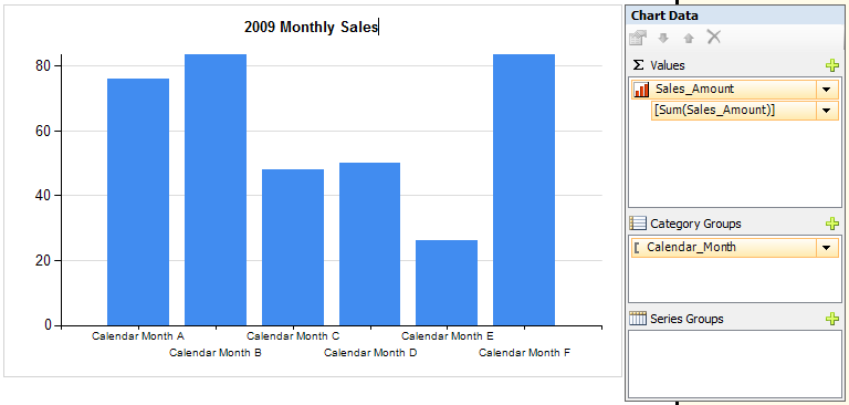 |
| Figure 2. Initial Chart |

- Right-click on the Horizontal Axis and select Horizontal Axis Properties... Set the Interval Property to 1.

- Set the months to sort naturally (Jan, Feb, Mar) instead of alphabetically. Right-click on the Category Group Calendar_Month and choose Category Group Properties. Click on the Sorting tab and hit the function (fx)key. Enter the following expression: =MONTH(Fields!Calendar_Month.Value & " 1").

- Set the formatting of the Vertical axis by right-clicking on the Vertical Axis and selecting Vertical Axis Properties... Select the Number tab and identify it as Currency, check the boxes for "Use 1000 seperator" and "Show Value in:" select Millions. Also select "Show symbol after value". Click OK.
Now when you preview your chart, it should like Figure 6 with the months in order and the vertical axis formatted. In this case, I went into the Format property and replaced the $ sign with an M. Got that from looking at how Power View formats numbers in the Millions which I think keeps it simple and easy to understand.
 |
| Figure 6. Intial resulting chart. |
At this point, you can add a new Chart Area to create the effect of a single column trellis chart. However, its important to note that each chart area you add needs its own Series. So to add a new series, simply drag and drop another column from your Dataset into the Chart Data pane. In our case, this will be the Sales_Quota_Amount column. After you do this, you will see multiple columns and a chart data pane that looks like Figure 7.
 |
| Figure 7. Adding a Series to a Column Chart |
|
|
|


 |
| Figure 11. Single column Trellis Chart. |
Now from this point, you can go straight into another visualization called a Correlation Bar Graph which data visualization expert Stephen Few designed and demonstrates in his book Show Me The Numbers. This involves superimposing two data series as columns to correlate two different scales. However, in our case, we will try to use the same scale since we're talking about Forecast vs. Actual in the Millions of dollars. Not exactly what Steve had in mind, but it gets the point across of how you can construct one of these in SSRS, nonetheless.
We start the process by making one of the series' column widths shorter and turning off the grid lines. To do this, you have to click on the top chart series and look at the Properties pane which should be on the right hand side in BIDS. Locate the Custom Attributes group and expand it to find the PointWidth Property which by default is set to .8. Set it to .5 for this exercise and hit enter. You'll notice the width of the bars in the top chart area will be narrower.
 |
| Figure 12. PointWidth property controls column width |
Now here's the tricky part. Select the 2nd Chart Area (the one on the bottom named Area1) and locate the Custom Positioning property in the Properties pane of BIDS. Expand it and set the Enabled property to True. Then pick the Default Chart Area and set its Custom Positioning/Enabled property to True also. Your graphs will look exactly like they did before. However, now that you've enabled Custom Positioning on both chart areas, you are able to size and locate the chart areas identically so that they overlap. Set both Chart Areas Custom Positioning Height to 80 and Top of 20.
 |
| Figure 13. ChartAreas property of Overall Chart |
When you've ordered the Chart Areas with the Sales_Amount series in front of the Sales_Quota_Amount series, you will see your Correlation Bar Graph take shape:
 |
| Figure 14. Correlated Bar Graph |
 |
| Figure 15. Correlated Bar Graph for 2008 with incorrect scale |
=IIF(Max(Fields!Sales_Amount.Value)>Max(Fields!Sales_Quota_Amount.Value),
Max(Fields!Sales_Amount.Value),
Max(Fields!Sales_Quota_Amount.Value))
Remember that each chart area has a Vertical Axis now. So to get to the Vertical Axis in the rear, use the ChartAreas property of the main chart to reorder the Chart Areas, enter the SSRS Expression, and then switch the chart area order back. If you do it right, you should get a graph like the one in Figure 15.
 |
| Figure 16. Correlated Bar Graph for 2008 sales, correct scale. |
=Fields!Calendar_Year.Value & " Monthly Sales"
 |
| Figure 17. Custom Legend Text |
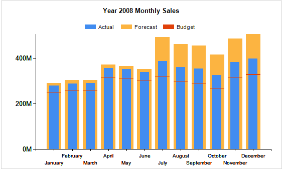
Once completed, you should have a nice looking graph like the one in Figure 18.
 |
| Figure 18. Correlated Bar Graph with Legend and Dynamic title |
Even though a Bullet Graph exists elsewhere in SSRS, I want to extend this chart capability to get us thinking outside of the box a little bit. I was excited when I got this far with charts, I think you'll be happy when you get through this next step as well. Besides, we're almost there. Just one more series to overlap and we'll be done.
To add another series, we need to add a calculated measure to our MDX query. The easiest way to do this when you're this far is by opening the Dataset properties and clicking on the Query Designer button. Once you're there, hit the Calculated Member button at the top of the designer:
Then for the Name of the Member, type in 'Budget', and for the Expression, type in ([Measures].[Sales Quota Amount],[Scenario].[Scenario Name].&[2]) as shown below:
 |
| Figure 19. Calculated Member Builder for adding Budget Column |
Now drag and drop the new Budget column from our Dataset into the Chart Data Pane under our Sales_Quota_Amount Series. Also, add a new Chart Area as before. It should line up automatically with the other two chart areas, but you must still assign the new Budget series to the new Chart Area. So right-click on the Budget series, go to Series Properties, and select the Axes and Chart Area tab and change the Chart Area property to Area2.
Now to get the target of Budget to show up like it would on a Bullet Graph, we need to change the chart type of Area2 from a Column Chart to a Column Range Chart. Right click on the Budget series and select Change Chart Type...

You will get the Chart Type selection dialog where you will scroll down to the Range-type charts and pick the Range Column chart.
 |
| Figure 21. Choosing Range Column chart type for the Target |
=SUM(Fields!Budget.Value -5)Preview the graph and you should get a Bullet Graph like so:
 |
| Figure 22. Bullet Graph |
I have to give credit for this entire post back to Stephen Few because I got this whole concept based on his idea of a Correlated Bar Graph. It started with a simple column chart, and all we did was add one or two more chart areas and overlap them with custom positioning, and voila! We get much better column graphs then we've ever thought possible. The extra visualization helps to correlate two related measures in a way that is easy to understand and brings a strong message to the end user.
In my next post, I will extend this capability of charts to make them interactive with the end user. Much like Power View does, and we will filter and highlight our data with a single click of the mouse. Stayed tuned for Part 2.
Amazing article....cheers!
ReplyDeleteFirst, thank you for your great article!
ReplyDeleteUnfortunately I have a problem. I don't have a finished table as input like this example has, instead the values of my series are calculated
e.g. sum(Fields!Field1.Value)+sum(Fields!Field2.Value)
So the max-function doesn't work.
Is there a possibility to access to the dates which comes from the Chart Data? Because to create the chart, the program first have to calculate the values.
Hi Betty. Thank you for reading!
DeleteMight a calculated field in the dataset help? If you open the dataset properties, click on 'Fields', and add a field at the bottom of the set using the same SSRS Expression, you can use this new calculated field for the MAX function I used in the article.
I'm unclear about your 2nd question regarding the dates in your Chart Data. I believe the answer is yes, if you use custom code in your report to somehow create a new dataset. If this is what you want to accomplish, I think your work will be hard to maintain down the road. With SSRS, it's always best to format and pre-calculate your data in the source before connecting it in your dataset.
Sounds like you may be embedding your chart in an application which creates a record set object that you want to use as the source for your report. If so, I advise temporarily creating a database table that will resemble that object with the data formatted as shown at the beginning of my post (or similar). Develop your report off of that table, and then embed it in your app and bind it to the recordset object.
Sorry if I am misunderstanding the question. Hope that helps. :/
Hi Angel. Thanks for your time!
DeleteYes, the solution to my first question will be to add a new field to my dataset.
But this is the point - I don't like to - only because RS is not able to display it on a logical way ;-)
I would prefer a command like
Chart1!ChartSeries1.Value - to use it for the max-function.
But I think, I expect to much from SSRS ;-)
Thank you for your help!
Ah yes. Now I gotcha. I definitely agree. One place this would be very beneficial for me is with dial gauges. When showing more than 1 (because how can you show just one dial gauge) and getting all the scales to match. I wish there was a Gauge1!Scale.MaximumValue, but alas, I expect too much as well. :)
DeleteAppreciate the comment very much Betty. Good luck in your report development and thanks for leaving a comment.
This is excellent! Many thanks.
ReplyDeleteThanks for reading Brian! Appreciate it.
Delete