Showing posts with label SSRS. Show all posts

Sunday, January 6, 2013

Recovering Report Manager items with T-SQL

Are you stuck not having access to Report Manager when you need access to a report item on the server? Well thanks to this detail blog post on BretStrateham.com, we can figure out what we need to get back anything that is in the Reporting Services database. This happened one time I needed access to a report I had developed with Report Builder and needed it back in a hurry. The Report Manager website was showing security key errors, and I just wanted to be sure I had backup copies of my reports just in case we couldn't get Reporting Services back online. This post outlines the steps I took since I had read-access to the ReportServer database on the SSRS box.

Run this Query

BretStrateham.com has a lot of detail queries you can use, but here's my 'streamlined' version which you can run in SQL Server Management Studio (SSMS) against the ReportServer database to start the process of retrieving report server objects.

SELECT 
 ItemID, 
 Path, 
 Name, 
 CreationDate, 
 ModifiedDate, 
 CONVERT(xml, convert(varchar(max), convert(varbinary(max), content))) AS ContentXML
FROM Catalog 
WHERE Content IS NOT NULL

Save the ConvertXML results

Looking at the results above, you'll notice that the data in the ContentXML column appears as a hyperlink. Clicking on this highlighted text will open a new query window with the XML inside. But before you do that, remember that report items in SSRS are all just XML files with different extensions. So copy the filename from the result set, click on the XML link, and do a Save As with the name + extension in double quotes to retrieve your file. Below are some of the extensions you'll likely use if you ever have to go through this. Feel free to comment if I'm missing any.
Report Item Extension
Report .rdl
Data Source .ds
Report model .smdl

Hope this helps any of you in a pinch. Thanks for reading.

Tuesday, April 10, 2012

Improve Data Visualization in Charts: Part 2


I recently heard a webinar that described Reporting Services reports as "static". Not true. Reporting Services can be made to be very interactive, you just have to get a little creative. The technique I'm about to describe I like to call the "1-Click Highlight & Filter." I believe this technique will give you, as report developers and BI consultants, an edge for creating interactive reports using SSRS.

Overview
We'll use parameters to hold user-selected values (either touched or clicked) on a chart, a table, a point in a map, or any other actionable report item in SSRS. The key to this whole thing is report object actions which you configure to point to the report itself. We can then influence anything on the report with SSRS Expressions. Background colors, borders, font styles, object sizes... Interactivity is an essential characteristics to good reporting, especially on mobile reporting on mobile devices such as iPad.

Let me show you this technique through an example using a column chart. We'll start by making the chart's bars highlight when a user selects one of the bars and filter another report object, in this case another table. This is a simple visualization technique to help a reader learn more about their data and work less. Some may argue this is more work for something so simple, but its worth it if your end users take advantage of this data visualization.

The initial chart
Start with the following dataset:
Figure 1. Initial Dataset
Drop a chart onto the report design surface and configure it with the following:
  • Size the chart to Width = 6in and Height = 3in. These properties are available in the Properties pane of BIDS.
  • Pick column chart and delete the Axis Titles and Legend
  • Put the Product_Category_Name field as the Category Group of the Chart Data Pane
  • Add Sales_Amount in the Values section of the Chart Data Pane.
  • (Optional) Right-click on the Vertical Axis and go to its properties to change the Number format to show in millions with 0 decimal places. With millions, I like to format the $ after the number and go into the LabelsFormat properties and switch out the '$' for 'M'. Resulting format code in the properties pane is shown as #,0,,'M';(#,0,,'M')
  • (Optional) Right-click on the chart title and hit the function button next to the Title text and type in the following SSRS Expression: 

=Parameters!DateCalendarYear.Label(0) & " Sales"

The resulting chart and chart data pane will look like so:
Figure 2. Initial Chart in Design View with Chart Data pane displayed.
Add a Parameter called @ProductCat which . Make it a hidden parameter and leave the Data Type as Text. In the Default Values tab, hit the Add button and type the value ALL without quotes. You'll see later that this default value will be used in the SSRS Expression to display all the data on the report.
Figure 3. @ProductCat Parameter Properties - General
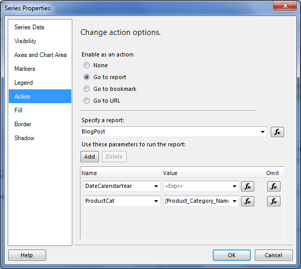
With the report still in Design mode, click one of the bars in the chart to select the series. The series supports report actions to jump to a different URL, a bookmark within the report, or another report altogether in the SSRS Project. In our case, we will jump to the report itself. So in the Series Properties dialog box, click on the Action tab. This is where the magic happens.
Figure 4. Series Properties - Actions
In the Acton properties, change the radio button to Go to Report. Under Specify a report, pick the report itself from the drop-down. Under Use these parameters to run the report, hit the Add button and select DropCalendarYear from the drop down. Hit the function button next to the Value drop-down, and type in the following SSRS Expression: =Parameters!DateCalendarYear.Value(0). Hit the Add button again and pick the ProductCat parameter from the drop-down. This time choose Product_Category_Name in the Values column from the drop-down. Click OK on the dialog.

Now the last part of the visualization: adding the SSRS Expression to the Series color to bring focus to the Product Category selected (either by touch or mouse click). Locate the Color property in the Properties pane. Click on its drop down and choose <Expression...>. For the expression, you will write:

=IIF(Fields!Product_Category.Value=Parameters!Product_Category.Value OR Parameters!Product_Category.Value="ALL", "DodgerBlue", "LightSkyBlue")

Now you're ready to test it out. Preview the report and you should see all the columns the same Dodger Blue. Select the column of one of the Product Categories, and you'll see all the other columns turn to "LightSkyBlue".
Figure 5. Resulting 1-Click highlight on a column chart
To improve the visualization, I've added a black 1.5pt-thick border to the series to appear when the user selects a particular Product Category. To do this add the following SSRS Expressions to the following Series properties:

  • BorderColor=IIF(Parameters!ProductCat.Value = Fields!Product_Category_Name.Value, "Black", "Automatic")
  • BorderStyle: =IIF(Parameters!ProductCat.Value = Fields!Product_Category_Name.Value, "Solid", "None")
  • Width: 1.5pt

We can use this same Series Action to filter another data region on the report. Drop a table onto the report design surface just below the chart and drag-n-drop the Product_Category and Sales_Amount fields from DataSet1 as columns in the table. You'll get the resulting table:
Figure 6. Initial Table using the same dataset as Chart
Now click on the Tablix and locate the Filters property in the Property pane. Click on the ellipses button and you the resulting dialog appears:
Figure 7. Tablix Properties - Filters
On the resulting dialog for Filters, click on the Add button and pick [Product_Category_Name] in the Expression field. In the Operator field, pick Like and then hit the function button in the Value field. Type the following SSRS Expression:

=IIF(Fields!Product_Category.Value=Parameters!Product_Category.Value, Parameters!Product_Category.Value, "*")

What this is doing is Filtering the tablix if one of the Product Categories matches the Parameter @ProductCat. If not, then it returns all the Product Categories. Note that filtering in SSRS, and asterisk '*' is a wild card character like % is in T-SQL.

When previewing the report and selecting a Product Category in the chart at top, you'll see the tablix beneath it filter for the same Product Category. In real life, you'll likely have more columns in the tablix to show better detail that tells more of a story to the end user.
Figure 8. Chart Highlight and Tablix Filter results
So I hope this helps you create better data visualizations through the use of Report Actions. Later, I'll blog about how to do this technique with Maps (Point Properties) and other types of Report objects. If you'd like to see how this looks on iPad, go out and download the evaluation app Mobi SSRS. Feel free to add comments on this post if you have questions or would like to see any other examples. Thanks for reading!

Wednesday, February 22, 2012

Improve Data Visualization in your SSRS Charts: Part 1

Chart Areas are a feature of SSRS Chart objects that can be utilized in enhancing data visualization in your charts.  I demonstrated this in a recent webinar, but I thought documenting the process might make it clearer on how to set this up to get several more visualizations under your belt. Chart Areas allow you to turn a single chart into a Trellis chart, a Correlated Bar Graph (coined term from Stephen Few's book Show Me The Numbers), or even a Bullet Graph.

Prepare the Data and Initial Chart
Let's start off with a common dataset from the Contoso BI Dataset Cube that we'll use throughout this post. The following query results in the 2009 Monthly Actual Sales and Sales Forecast for Contoso. First create a new SSRS report in Business Intelligence Development Studio (BIDS) with a Data Source pointing to the Contoso cube. Create a new DataSet, and copy/paste the following into your Query text:

SELECT NON EMPTY { 
[Measures].[Sales Quota Amount], 
[Measures].[Sales Amount] } ON COLUMNS, 
NON EMPTY { 
([Date].[Calendar Month].[Calendar Month].ALLMEMBERS ) } 
DIMENSION PROPERTIES MEMBER_CAPTION, MEMBER_UNIQUE_NAME ON ROWS 
FROM ( SELECT ( { [Scenario].[Scenario Name].&[3] } ) ON COLUMNS 
FROM ( SELECT ( { [Date].[Calendar Year].&[2009] } ) ON COLUMNS 
FROM [Sales])) 
WHERE ( [Date].[Calendar Year].&[2009], [Scenario].[Scenario Name].&[3] ) 
CELL PROPERTIES VALUE, BACK_COLOR, FORE_COLOR, FORMATTED_VALUE, FORMAT_STRING, FONT_NAME, FONT_SIZE, FONT_FLAGS
If you're used to using the Query Designer, your dataset should look something like this:
Figure 1. Query Designer with the layout of Contoso's 2009 Actual/Forecast Sales
In Query Designer, drag and drop the fields highlighted yellow into the Data section, and drag the Date/Calendar Year, and Scenario/Scenario Name attributes into the filter section as shown in the figure picking the Filter Expressions shown (Year 2009 & Forecast). Once completed either through Query Text or Query Designer, press the 'Refresh Fields' button in the Dataset properties. If there are no errors, then you can now proceed with creating the initial chart.
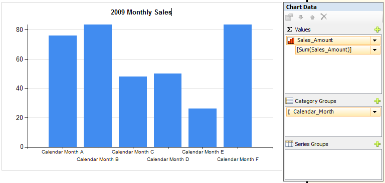
Our initial chart will be a column graph of the Sales Amount vs. the Calendar Months. To do this, insert a chart onto the design surface, drag and drop the Calendar_Month field to the Category Groups in the Chart Data pane, and then drag and drop the Sales_Amount column into the 'Æ© Values' section of the Chart Data pane. Delete the Legend and your Axis Titles on the Vertical Axis and Horizontal Axis. Change the Chart Title to read '2009 Monthly Sales' and the resulting chart and data pane should like Figure 2.
Figure 2. Initial Chart
Now just a couple more things to fix on this initial chart:

  • Right-click on the Horizontal Axis and select Horizontal Axis Properties... Set the Interval Property to 1.


  • Set the months to sort naturally (Jan, Feb, Mar) instead of alphabetically. Right-click on the Category Group Calendar_Month and choose Category Group Properties. Click on the Sorting tab and hit the function (fx)key. Enter the following expression: =MONTH(Fields!Calendar_Month.Value & " 1").
  • Set the formatting of the Vertical axis by right-clicking on the Vertical Axis and selecting Vertical Axis Properties... Select the Number tab and identify it as Currency, check the boxes for "Use 1000 seperator" and "Show Value in:" select Millions. Also select "Show symbol after value". Click OK.


Now when you preview your chart, it should like Figure 6 with the months in order and the vertical axis formatted. In this case, I went into the Format property and replaced the $ sign with an M. Got that from looking at how Power View formats numbers in the Millions which I think keeps it simple and easy to understand.
Figure 6. Intial resulting chart.
Creating a Trellis Chart
At this point, you can add a new Chart Area to create the effect of a single column trellis chart. However, its important to note that each chart area you add needs its own Series. So to add a new series, simply drag and drop another column from your Dataset into the Chart Data pane. In our case, this will be the Sales_Quota_Amount column. After you do this, you will see multiple columns and a chart data pane that looks like Figure 7.
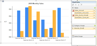
Figure 7. Adding a Series to a Column Chart
Now right-click on an empty area in the main Chart and you should see a selection for Add a New Chart Area. Select it and you will see an empty chart area appear underneath your main chart. It's empty because we must assign the second series (Sales_Quota_Amount) to that chart area by right-clicking on the series in the Chart Data pane, going to Series Properties, and change the Chart Area from Default to Area1.

Step 1: Add New Chart Area
Step 2: Go to Series Properties
Step 3: Update Chart Area for that series.
Now add a the Vertical Axis titles back to the top and bottom Chart Areas, and you get a nicely aligned trellis chart (or at least the beginning of one).
Figure 11. Single column Trellis Chart.
Creating a Correlated Bar Graph
Now from this point, you can go straight into another visualization called a Correlation Bar Graph which data visualization expert Stephen Few designed and demonstrates in his book Show Me The Numbers. This involves superimposing two data series as columns to correlate two different scales. However, in our case, we will try to use the same scale since we're talking about Forecast vs. Actual in the Millions of dollars. Not exactly what Steve had in mind, but it gets the point across of how you can construct one of these in SSRS, nonetheless.
We start the process by making one of the series' column widths shorter and turning off the grid lines. To do this, you have to click on the top chart series and look at the Properties pane which should be on the right hand side in BIDS. Locate the Custom Attributes group and expand it to find the PointWidth Property which by default is set to .8. Set it to .5 for this exercise and hit enter. You'll notice the width of the bars in the top chart area will be narrower.
Figure 12. PointWidth property controls column width

Now here's the tricky part. Select the 2nd Chart Area (the one on the bottom named Area1) and locate the Custom Positioning property in the Properties pane of BIDS. Expand it and set the Enabled property to True. Then pick the Default Chart Area and set its Custom Positioning/Enabled property to True also. Your graphs will look exactly like they did before. However, now that you've enabled Custom Positioning on both chart areas, you are able to size and locate the chart areas identically so that they overlap. Set both Chart Areas Custom Positioning  Height to 80 and Top of 20.

Figure 13. ChartAreas property of Overall Chart
Quick Tip: If you get stuck with one Chart Area in front of the other, don't worry. Click on the overall Chart object and locate the ChartAreas property in the Property Pane of BIDS. Hit the ellipse button and you can reorder which Chart Area comes in front of the other one. You will have to do this so that your Sales_Amount series is in front of the Sales_Quota_Amount series before you're finished.

When you've ordered the Chart Areas with the Sales_Amount series in front of the Sales_Quota_Amount series, you will see your Correlation Bar Graph take shape:
Figure 14. Correlated Bar Graph
Now before you think this is pretty cool, there is a catch. With this data set filtered for 'Year 2009', it just so happens that the vertical scale for both Series are identical. However, in the real world, they will likely be off, especially at the start of each month. To demonstrate the issue, change the Calendar Year filter in the dataset from 'Year 2009' to 'Year 2008'. Notice the vertical scale will be off like so.

Figure 15. Correlated Bar Graph for 2008 with incorrect scale
So to correct this issue to be able to "correlate" the series in tandem, you have to set the Maximum of each Chart Area's vertical scale to the greatest number in either series. You can do this with the following SSRS expression entered into the Vertical Axis Maximum property of each Chart Area:

=IIF(Max(Fields!Sales_Amount.Value)>Max(Fields!Sales_Quota_Amount.Value),
Max(Fields!Sales_Amount.Value),
Max(Fields!Sales_Quota_Amount.Value))

Remember that each chart area has a Vertical Axis now. So to get to the Vertical Axis in the rear, use the ChartAreas property of the main chart to reorder the Chart Areas, enter the SSRS Expression, and then switch the chart area order back. If you do it right, you should get a graph like the one in Figure 15.
Figure 16. Correlated Bar Graph for 2008 sales, correct scale.
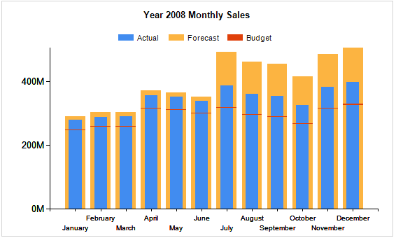
Now its clear: when comparing 2008 results (Fig. 16) with 2009 (Fig. 14), you'll notice that Contoso didn't meet their 2008 Forecasts, but in 2009, they beat their Forecasts every single month. To make this even clearer and more dynamic, make the title dynamic and add a legend. Add the Calendar Year to the Dataset and then into the Title with an SSRS Expression:
=Fields!Calendar_Year.Value & " Monthly Sales"
Figure 17. Custom Legend Text
Add a legend and dock it to the top of the chart. Change the legend text for each series by right-clicking on the series in the Chart Data pane, selecting Series Properties, selecting the Legend tab and filling in the Custom Legend Text  property.

Once completed, you should have a nice looking graph like the one in Figure 18.


Figure 18. Correlated Bar Graph with Legend and Dynamic title
Creating a Bullet Graph
Even though a Bullet Graph exists elsewhere in SSRS, I want to extend this chart capability to get us thinking outside of the box a little bit. I was excited when I got this far with charts, I think you'll be happy when you get through this next step as well. Besides, we're almost there. Just one more series to overlap and we'll be done.
To add another series, we need to add a calculated measure to our MDX query. The easiest way to do this when you're this far is by opening the Dataset properties and clicking on the Query Designer button. Once you're there, hit the Calculated Member button at the top of the designer:


Then for the Name of the Member, type in 'Budget', and for the Expression, type in ([Measures].[Sales Quota Amount],[Scenario].[Scenario Name].&[2]) as shown below:

Figure 19. Calculated Member Builder for adding Budget Column
Drag and Drop that into the Dataset and accept all the prompts.

Now drag and drop the new Budget column from our Dataset into the Chart Data Pane under our Sales_Quota_Amount Series. Also, add a new Chart Area as before. It should line up automatically with the other two chart areas, but you must still assign the new Budget series to the new Chart Area. So right-click on the Budget series, go to Series Properties, and select the Axes and Chart Area tab and change the Chart Area property to Area2.

Now to get the target of Budget to show up like it would on a Bullet Graph, we need to change the chart type of Area2 from a Column Chart to a Column Range Chart. Right click on the Budget series and select Change Chart Type...

You will get the Chart Type selection dialog where you will scroll down to the Range-type charts and pick the Range Column chart.
Figure 21. Choosing Range Column chart type for the Target
Now after selecting this type of chart, you will notice in the Chart Data Pane, two fields under the series which stand for the high and low of the range. The High will simply be the SUM([Budget]) value, and the low we'll set manually to something a little bit smaller. In this case, click on the arrow next the word "Low" and choose expression. Type in the following SSRS Expression:
=SUM(Fields!Budget.Value -5)
Preview the graph and you should get a Bullet Graph like so:
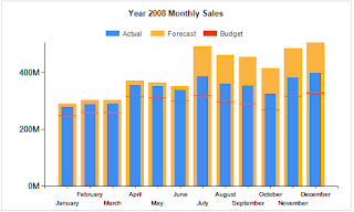
Figure 22. Bullet Graph
Conclusion
I have to give credit for this entire post back to Stephen Few because I got this whole concept based on his idea of a Correlated Bar Graph. It started with a simple column chart, and all we did was add one or two more chart areas and overlap them with custom positioning, and voila! We get much better column graphs then we've ever thought possible. The extra visualization helps to correlate two related measures in a way that is easy to understand and brings a strong message to the end user.

In my next post, I will extend this capability of charts to make them interactive with the end user. Much like Power View does, and we will filter and highlight our data with a single click of the mouse. Stayed tuned for Part 2.

Tuesday, February 14, 2012

SSRS Chart Anatomy 101

I did a presentation today on SSRS Charts through Pragmatic Works free training program called Training on the T's. It was a great experience and I appreciate everyone that checked it out. If you aren't already watching these webinars, then you should. I've learned a lot from past webinars and they've got some great webinars coming up in the near future.

Big THANK YOU to Devin Knight (Twitter | Blog) for inviting me to show my stuff.  The presentation slide deck is down below as well as a link with the SSRS Project Files from my demo. You will need to download and install the Contoso BI Demo Dataset in order to get these demo's working. The video for the webinar will always be available on the Pragmatic Works website after its done being uploaded (I'm told by the end of this week).

SSRS Chart Anatomy 101

View more presentations from aabundez

For some of you that asked the question about how to order months in their natural order, the SSRS Expression I used in the Sorting property of the Category Group properties was:
=MONTH(Fields!Calendar_Month.Value & " 1") 
As discussed, without this expression, SSRS will order the months alphabetically which won't make sense on your chart.

Here is a link to a Google Docs folder that has the Zip file for my presentation.

Thanks again! Look forward to more webinars in the future! :)

Sunday, October 2, 2011

Fundamentals of the Tablix in SSRS 2008

The Tablix control in SQL Server Reporting Services (SSRS) is the most important control in your report design arsenal. It is a data region which displays your data in 3 different ways. Like Edward Tufte says, "Above all else, display the data." This control does exactly that. I've given a presentation on the different ways a Tablix can be used from a business perspective. You can download the slide deck here: Unleash the Tablix Slide Deck.

A Tablix is not shown in the Toolbox as a single control, but as 3 different starting points: Table, Matrix, and List. Don't worry about which one you start with because a tablix is easily molded to be a Table, Matrix, List, or combination of these. What you do need to remember are the fundamental differences between each one. It helps a lot to know how to go from one to the other during development. Especially in situations where you've done a lot of work with SSRS Expressions and Formatting that you'd like to keep right where they are.

Here are the fundamentals of each "starting point" (click on the images for full-size):


List Demo

Matrix Demo


  • Table is unidirectional. Its a lookup of information. It contains a single Row Group to start, but you create Parent Groups to Group the data and start Prioritizing it for the end-user.

  • List is nothing more than a rectangle in a cell. This allows custom layouts of all other items in the Toolbox.

  • Matrix is bidirectional. You begin with one Row Group and one Column Group. Now you can display intersections of Business Entities like Direct Cost Types and Product Lines, Department and Expense Types, Sales Regions and Company Division.

In addition to the technical terms, as a Report Developer, you should also be thinking about how to visually display the data in a simple, elegant, and efficient way. I've found the following guidelines from Stephen Few's book, Show Me  The Numbers, to be extremely helpful:

  1. Group the data.

  2. Prioritize the data.

  3. Sequence the data.

Great Tablix Tips from around the web:


  • To create stepped reports and Toggle Items (or Drill-Downs as they are popularly called), my buddy Dustin Ryan made a great blog post. Check it out here.

  • Want to repeat the headers of your Tablix? SQLChick.com has a great blog post on what works, and even more importantly, what does not work.