I recently heard a webinar that described Reporting Services reports as "static". Not true. Reporting Services can be made to be very interactive, you just have to get a little creative. The technique I'm about to describe I like to call the "1-Click Highlight & Filter." I believe this technique will give you, as report developers and BI consultants, an edge for creating interactive reports using SSRS.
Overview
We'll use parameters to hold user-selected values (either touched or clicked) on a chart, a table, a point in a map, or any other actionable report item in SSRS. The key to this whole thing is report object actions which you configure to point to the report itself. We can then influence anything on the report with SSRS Expressions. Background colors, borders, font styles, object sizes... Interactivity is an essential characteristics to good reporting, especially on mobile reporting on mobile devices such as iPad.
Let me show you this technique through an example using a column chart. We'll start by making the chart's bars highlight when a user selects one of the bars and filter another report object, in this case another table. This is a simple visualization technique to help a reader learn more about their data and work less. Some may argue this is more work for something so simple, but its worth it if your end users take advantage of this data visualization.
The initial chart
Start with the following dataset:
 |
| Figure 1. Initial Dataset |
- Size the chart to Width = 6in and Height = 3in. These properties are available in the Properties pane of BIDS.
- Pick column chart and delete the Axis Titles and Legend
- Put the Product_Category_Name field as the Category Group of the Chart Data Pane
- Add Sales_Amount in the Values section of the Chart Data Pane.
- (Optional) Right-click on the Vertical Axis and go to its properties to change the Number format to show in millions with 0 decimal places. With millions, I like to format the $ after the number and go into the LabelsFormat properties and switch out the '$' for 'M'. Resulting format code in the properties pane is shown as #,0,,'M';(#,0,,'M')
- (Optional) Right-click on the chart title and hit the function button next to the Title text and type in the following SSRS Expression:
=Parameters!DateCalendarYear.Label(0) & " Sales"
 |
| Figure 2. Initial Chart in Design View with Chart Data pane displayed. |
 |
| Figure 3. @ProductCat Parameter Properties - General |
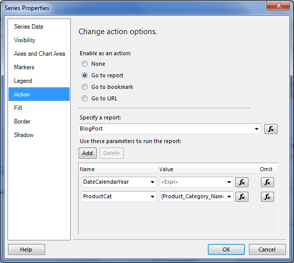 |
| Figure 4. Series Properties - Actions |
Now the last part of the visualization: adding the SSRS Expression to the Series color to bring focus to the Product Category selected (either by touch or mouse click). Locate the Color property in the Properties pane. Click on its drop down and choose <Expression...>. For the expression, you will write:
=IIF(Fields!Product_Category.Value=Parameters!Product_Category.Value OR Parameters!Product_Category.Value="ALL", "DodgerBlue", "LightSkyBlue")
Now you're ready to test it out. Preview the report and you should see all the columns the same Dodger Blue. Select the column of one of the Product Categories, and you'll see all the other columns turn to "LightSkyBlue".
 |
| Figure 5. Resulting 1-Click highlight on a column chart |
- BorderColor: =IIF(Parameters!ProductCat.Value = Fields!Product_Category_Name.Value, "Black", "Automatic")
- BorderStyle: =IIF(Parameters!ProductCat.Value = Fields!Product_Category_Name.Value, "Solid", "None")
- Width: 1.5pt
We can use this same Series Action to filter another data region on the report. Drop a table onto the report design surface just below the chart and drag-n-drop the Product_Category and Sales_Amount fields from DataSet1 as columns in the table. You'll get the resulting table:
 |
| Figure 6. Initial Table using the same dataset as Chart |
 |
| Figure 7. Tablix Properties - Filters |
=IIF(Fields!Product_Category.Value=Parameters!Product_Category.Value, Parameters!Product_Category.Value, "*")
What this is doing is Filtering the tablix if one of the Product Categories matches the Parameter @ProductCat. If not, then it returns all the Product Categories. Note that filtering in SSRS, and asterisk '*' is a wild card character like % is in T-SQL.
When previewing the report and selecting a Product Category in the chart at top, you'll see the tablix beneath it filter for the same Product Category. In real life, you'll likely have more columns in the tablix to show better detail that tells more of a story to the end user.
 |
| Figure 8. Chart Highlight and Tablix Filter results |
Hi Angel,
ReplyDeleteThis is too good, thanks for putting this together. Apprecitiate your help. I will try out this and let you know the result :)
This is exactly what my boss wanted!!! But when I tried to set the table to filter with the column clicked it wouldn't work. It just showed all categories. I changed the LIKE to = and it would open empty but when I clicked on a column then it would display the amounts for that category. Any ideas how to fix this?
ReplyDeleteBorgata Hotel Casino & Spa - Travel Weekly
ReplyDeleteBorgata 충청남도 출장마사지 Hotel Casino & 경상남도 출장샵 Spa locations, rates, amenities: 울산광역 출장마사지 expert Atlantic City research, only at Hotel 부천 출장마사지 and Travel Index.com. Rating: 9/10 · 서귀포 출장샵 1,610 reviews